
By now you may have gotten to know me as a bit of a travel fanatic. I love jumping on a plane and experiencing all the world has to offer. Travel is my passion, and it's what I fill every spare moment thinking about and doing -- both traveling itself, and then blogging about our tried-and-true travel tips for you, our wonderful readers!
But to pull back the curtain a little bit, I'm a User Experience Designer by day, meaning I create and improve online experiences so they are as smooth and intuitive as possible. I draw from my background in marketing and psychology, along with my love of empathizing and listening to people. And to be honest, I love what I do!
As might be expected, I often find overlap between my two passions, travel and UX. I notice travel-related experiences that are top notch, as well as those that are frustrating, too. Either way, I naturally want to analyze what could make them better.
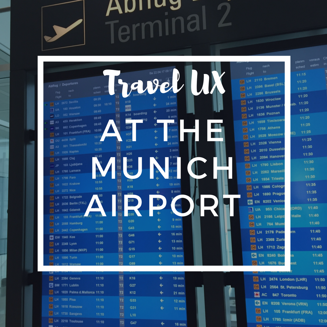
I found myself in the Munich airport recently, where I found a little gem that was so simple, yet effective. I'm talking about the departure monitors.

If you notice on the zoomed in version below, on the right are two columns that are pretty helpful -- they tell you which direction will lead you to your gate and how many minutes it will take you to get there:

If you've never been to Terminal 2 in the Munich Airport before, I'd describe it as a high-end shopping mall somehow misplaced in a beautiful, new airport. It is world-class, and I'm not surprised that in the land of stereotypical German efficiency, this departure monitor is the norm!
well done parts of experience
- Quick communication: As I mentioned, this airport is big and has a lot going on, so I can see how one could get turned around AND not realize a walk within the same terminal could take over 20 minutes, for example. Communication is key and they're nailing it here for an airport of this size.
- Common pattern usage: People all over the world are used to departure monitors in one form or another. Travelers have learned to scan monitors like these, sorted by time, to find their flight to know which gate to go to. These appended "direction" columns (as I'll call them) quickly give further information to the traveler embedded in a pattern with which they're familiar.
- Zebra striping: The grouping of three lines of flights at a time using the alternating light and dark blue background helps the user keep his place while scanning the board. I like the choice to not employ this "zebra striping" for every line, as the text is on the smaller side, and it could create a dizzying effect.
What could be improved
- Icons: I'm curious if the icon of a stick figure is the most obvious and universal. In terms of consistency, why is it the only icon used on this entire display? The number of minutes could potentially be mistaken for other things, like how long until boarding starts, for example. That's why icons accompanied by text are often preferred, to help avoid confusion. Cross-cultural user testing would be interesting here.
- Use of space and clarity: Another component on this display that may not be clear to the user is the green light on the far left. I'm assuming this indicates that the flight is boarding. However, if that's the case, this is also indicated by the word "boarding" near the middle of the display. To make the best use of space and perhaps even to slightly increase the text size, these two elements could easily be combined, perhaps into "boarding" text that's green and blinking, for example, if that's where we want to draw the user's eye.
- Make it personalized: A display like this is great for the travelers who are rushing to their flights and need to quickly confirm their gate. But another type of traveler is the one with a long layover. For those types of travelers, it could be nice to have a self-service option where they could scan their boarding pass and be provided with a map of how to get to their gate and suggested food or shopping options along the way. In our case in Munich, we had a lengthy layover, and didn't realize until we got to our gate at the far end of the terminal that there weren't many food options nearby. It would have been nice to know that before we reached our gate, being in the jetlagged state we were in and all...
All in all, I think this display does its job, utilizing familiar patterns, and including the directional display that's needed in an airport of this size. Well done Munich airport!
What travel experiences do you love or hate? I'm always up for experiences to analyze!